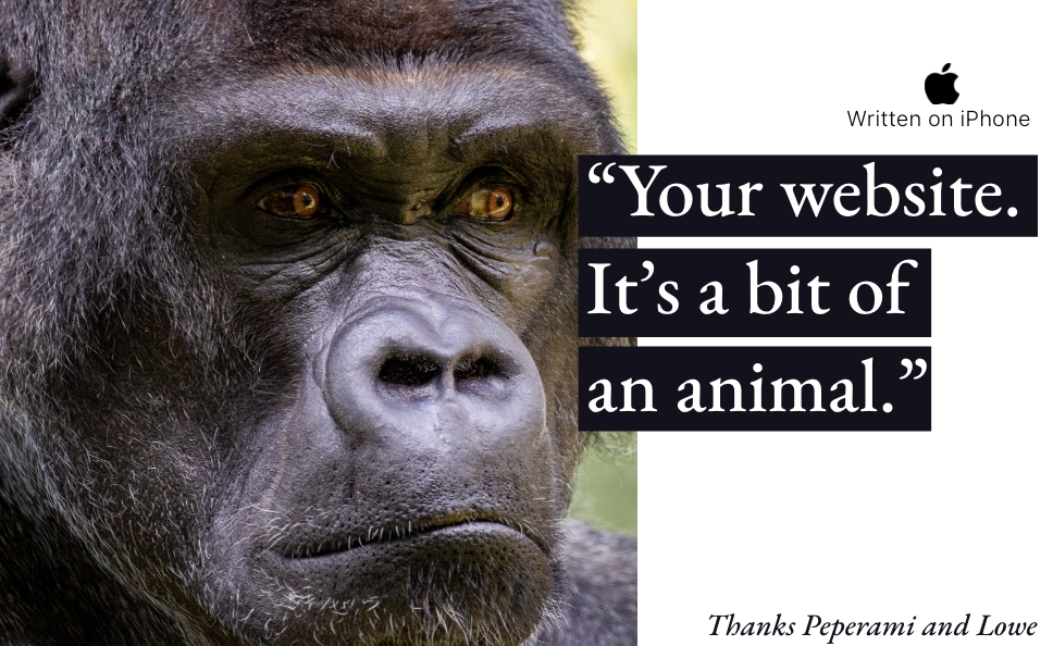
For every $1 invested in your website, a typical business can expect $100 in return.
Thanks Forrester Research
In this article we look at how you can achieve fame, vast riches (and in some cases, redemption) by making your website a winner. Not at Crufts. But amongst your competitors.
What users and search engines value in a website today is vastly different to five years ago. We provide some benchmark data, showing how these factors affect your website value. And like a good pet, we give some advice on how your website should be developing, performing and behaving.
We’ve analysed what the most successful online propositions do and how they have achieved extraordinary success.
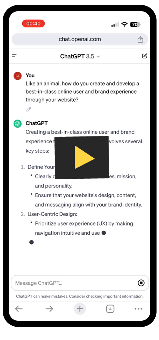
And by popular demand, we’ve included the ChatGPT version in video and its transcript.
In a future article, we will also look at why and when you might invest in an app, versus investing in your website – and the resulting trade-offs between the two. (A bit like deciding whether to get another dog, at the expense of your current pooch).
Battle of the brochures

Thanks Braunston Print
Not so long ago, the CEO of a £70m travel business told us that he thought investing in brochures would give his business a better return than investing in his website.
We got to work.
Through customer research, user behaviour analysis, continuous testing and website evolution, we transformed the economics of the business. And produced a juicy outcome: a £92k investment in the user experience of this website led to a £1.9m of incremental, annual recurring margin.
This value was created through a 23% improvement in the lead conversion ratio and an increase in online brand visibility of 54%, delivering a reduction in the cost of customer acquisition of 42%, and a 4.6 percentage point improvement in gross margin.
£20m of incremental business and brand value created in 18 months.
We won’t bother you with the CEO’s brochure numbers, but suffice to say, they weren’t so great. (Note to self: must speak to him about how he’s getting on with ChatGPT).
Let’s start at the beginning
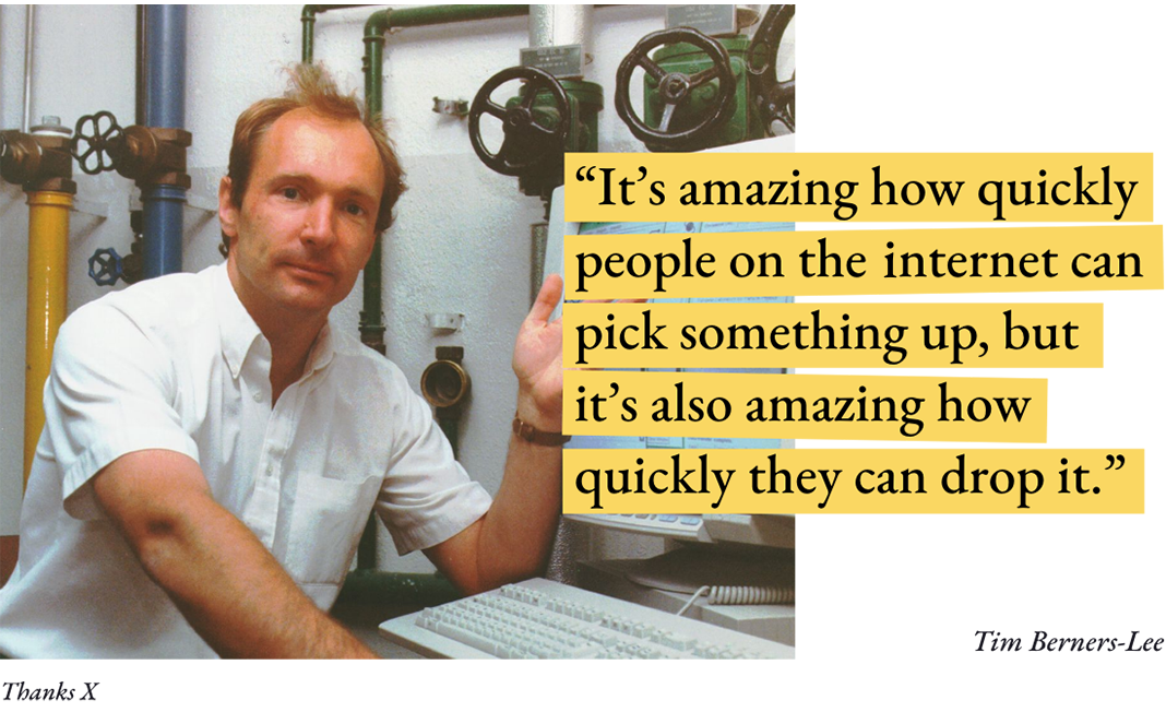
Since the first website was created by Tim Berners-Lee in 1991, the proliferation of web content has grown exponentially, every year. Whilst it is nigh on impossible to count the number of websites, Siteefy estimate that 252,000 new websites are created every day. (Although some estimates suggest that only 16.5% of websites are actually active).
In 2006, it was estimated that there were approximately 85 million websites. Today, there are over 1.1 billion. The question we might ask is: how to make yours famous and distinctive?
Thanks Siteefy
And the winner is?
The world’s most popular websites highlight what people want to use the web for: searching, educating, communicating, buying, fantasising and entertainment.
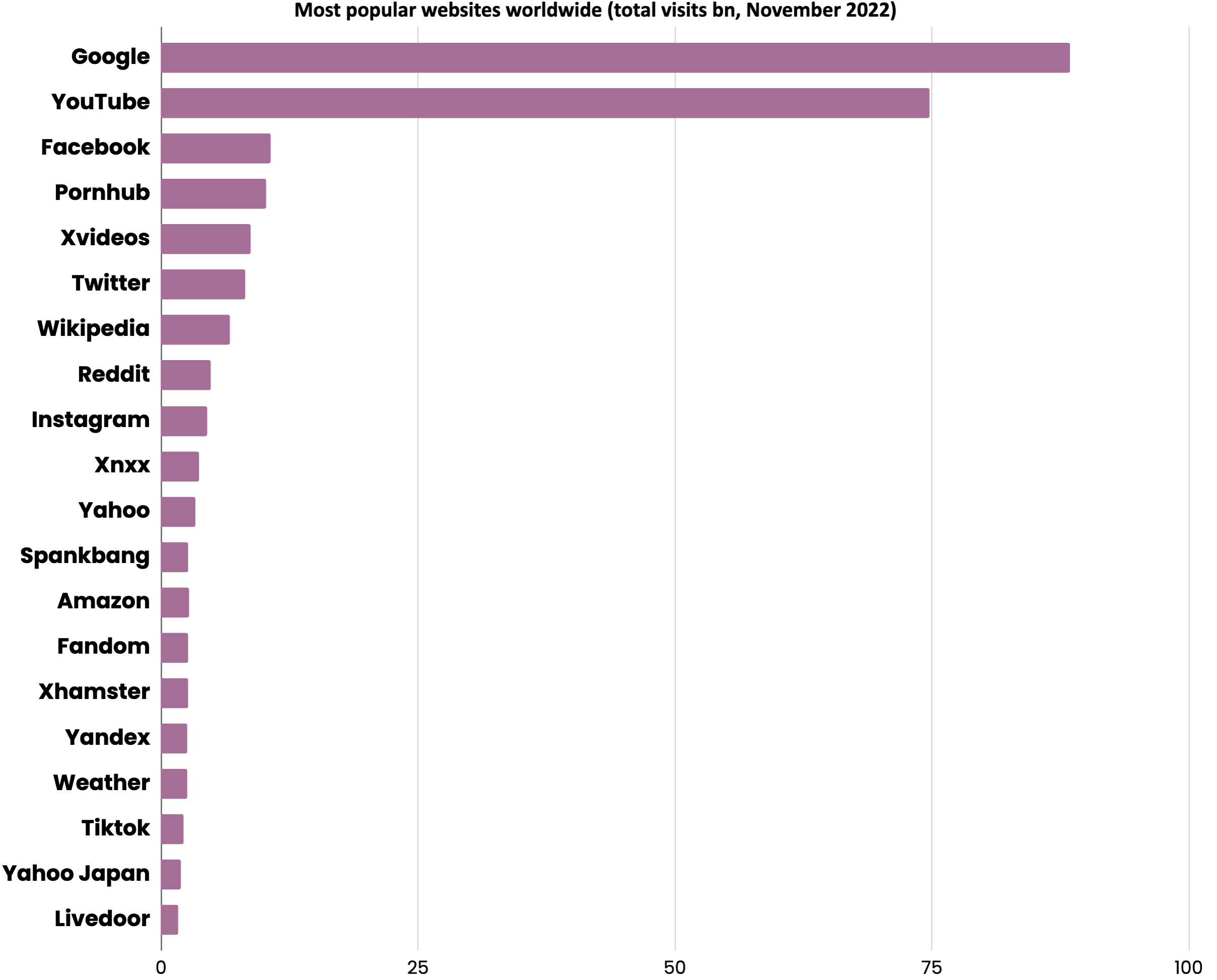
Thanks Data Reportal, We Are Social, SEMRush, Meltwater
And you might notice that the most successful brands are superb at delivering on that “purpose”. (We’re not talking purpose-driven here. We’re talking about the job that your website is there to do).

If your business’s purpose is to sell: have the slickest, most efficient buying experience on the planet. If it’s to inform: make your most valuable information immediately accessible, obvious and the most comprehensive amongst your competitors. Seems obvious, doesn’t it? And easy?
Beauty and the Beast

Thanks DeviantArt
Today, booking.com is valued at over $110bn, makes a 30% EBITDA margin and is estimated to process over 10% of all accommodation bookings worldwide.
Source: addmustard analysis, booking.com annual Nasdaq 10-K filing
Why are some websites so much more popular, valuable and perform better than others?
To answer this question, we’ve picked the fiercely competitive sector of online hotel booking, to illustrate the most important success factors. We think this sector provides some fascinating insight into what it takes to have a category-killer website (and then an app).
In the early noughties, there was an explosion in hotel booking websites: Expedia, Travelocity, LateRooms, lastminute.соm, Agoda, Hotels.соm, Mr & Mrs Smith. Today, bооking.соm is valued at over $110bn, makes 30% EBITDA margin and is estimated to process over 10% of all accommodation bookings worldwide. It is estimated to have been one of Google’s top three customers, for much of its life.
What sets it apart in this highly competitive and seemingly commoditised sector?
“We do one hundred things, one percent better than our competitors.”
Former CEO, booking.com
Like many other category winners, booking.соm has:
• A senior management team, literate in, passionate about and totally committed to technology.
• A single-minded focus on its core proposition.
• A clear and uniquely differentiated proposition for both customers and hotels.
• A scientific and ruthlessly methodical approach to brand, user and supplier experience. (At any time, bооking.соm usually analyses over 125 concurrent, multivariate tests that are running on its website).
• An evangelical dedication to listening to customers and studying their behaviour, which drives a level of innovation that competitors struggle to keep pace with.
Rank like a Magician
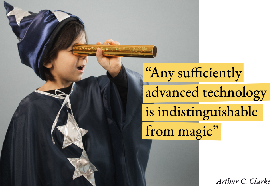
What consumers and search engines look for in a website today is very different to what they used to value, even five years ago. Content stuffing, link farming, domain mimicry and all-you-can-eat content will damage your brand experience, website authority and search engine rankings. And diminish sales, margins, ROI and the value of your business.
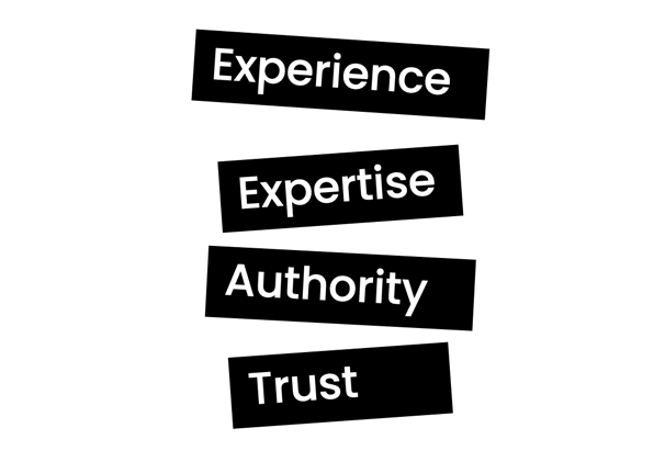
Today, websites are rewarded by customers and the major search engines for being slimmed down, relevant, authoritative and having a slick user experience. In a nutshell, Google requests that websites now have four key characteristics:
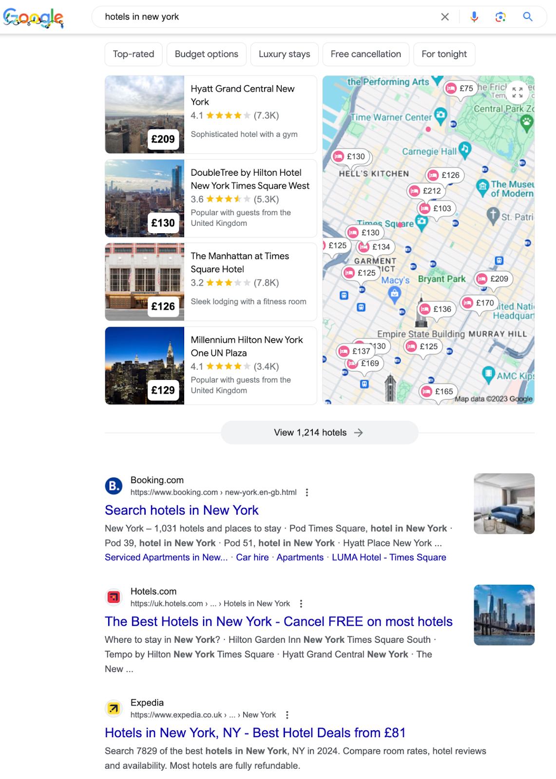
Having created a magical brand and user experience that provided travellers and hoteliers with 100 features, 1% better than its competitors, booking.соm has dominated the search engine rankings for years. This has been a key driver of the success its customer acquisition, retention and the value of its brand.
Thanks Google
The scores are in

Thanks Yahoo
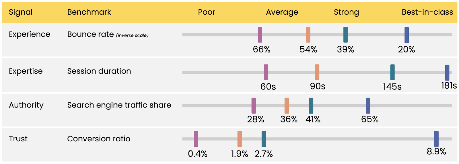
How do you know how you are performing? Help is on hand to benchmark your website both against best-in-class competitors and against the leading websites in the world.
Thanks addmustard data team, SEMrush, databox, WordStream, tooltester
Benchmarks can vary significantly between industries, markets and the maturity of your brand. The weighting of marketing channels, media spend and content can also significantly influence your scores.
But if you want to be a winner, it’s handy to know what “good looks like” to your customers and against your competitors.
It’s a small world

Thanks Ray Tang
When was the last time you ordered a takeaway on a desktop computer?
Websites that are specifically designed and optimised for mobile devices are proven to be the most successful amongst their peers. With 56% of all website traffic originating from mobile devices, the mobile experience is significantly more important than other devices.
Google, after recent updates to its search algorithm, places higher weighting on the performance and experience of your mobile website than your desktop version. It will reward you with greater brand visibility and higher rankings.
More than 50% of people say they won’t consider purchasing from a brand that has a poorly designed mobile site.
Thanks Google
So when you design and test your website, sure as eggs is eggs, your design team, coding team and testing team almost certainly do their work on a desktop computer (large screen). Whereas the reality is, you want your leadership and your website team all thinking and behaving like they are on their mobile devices (small screen), all of the time.

Thanks Zoe Lin
And the beauty of designing for a small world is that you’ll have to keep it simple. And we all know the power of simplicity. Our recent article on the subject provides some clues:
Speed wins

Thanks Twist
As well as a frictionless user experience, we know that speed is a fundamental contributor to the success of your website.
Bounce rates increase by 123% if page loading time becomes more than one second.
Thanks Google
According to Forbes, users form their opinion of a website in typically 50 milliseconds. And they expect a site to fully load in under two seconds. In fact, 47% of users do not wait more than two seconds before they head for the exit.
There are plenty of platforms that will test and report your website performance. We would strongly advocate introducing automated tools that monitor performance and alert degradation.
Mirror, mirror on the wall, who has the best UX* of them all?

Thanks Etsy
*UX means user experience.
There are 15 significant factors affecting the value of your website, its conversion and user engagement:
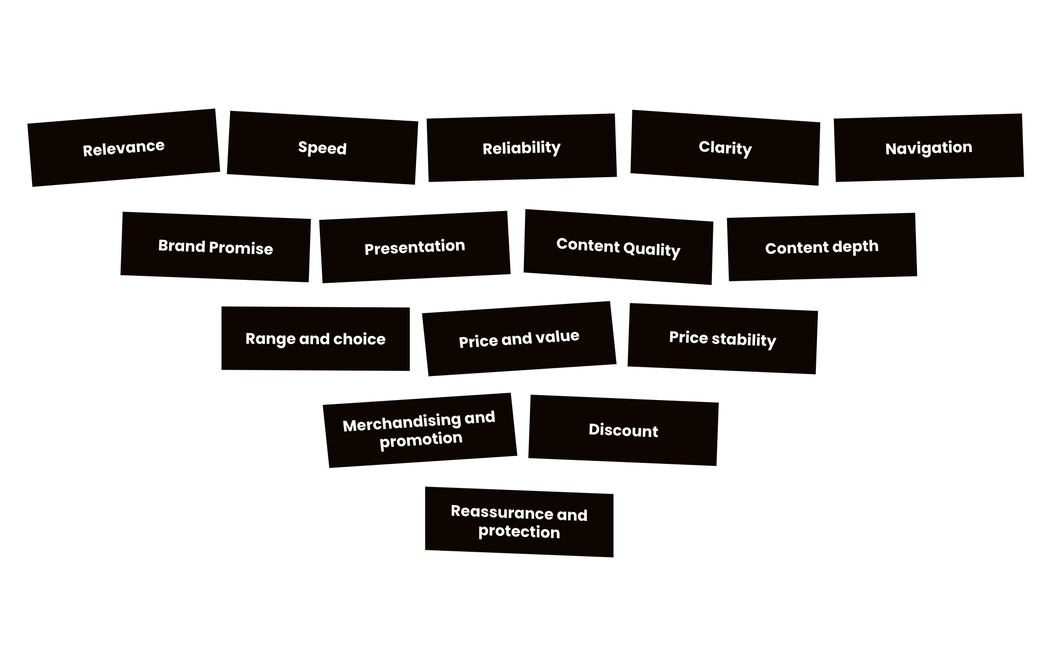
88% of users said they would not return to a website, where they had had a bad experience, just once.
Thanks Forrester Research
All of these factors need continuous improvement in harmony with each other. To create a category-killer website requires prioritisation, investment, joined-up thinking and long-term commitment.
The United Nations. Online.

Thanks Reddit
You’ve probably heard lots about user experience (UX) and conversion rate optimisation (CRO) in recent years. They are certainly complex and changing rapidly. And maybe you think your website team should look after these things.
In truth, user experience needs to involve your product, commercial, marketing, sales, customer service, operations and often, finance teams. And the best performing companies, with a strong online presence, give it significant attention from their senior leadership team.
77% of SME leaders do not have the skills required to successfully implement new technology into their businesses.
Thanks The Open University
Many conversion rate optimisation and user experience projects now use highly valuable and sophisticated data analysis tools. But for all the great CRO and user experience data you can collect, you know what we’re going to recommend: listen to your real-world customers about what they think of your web site. (If you want to know more about customer research and its impact on brand, user experience and the value of your business, here’s our article):
I want to break free
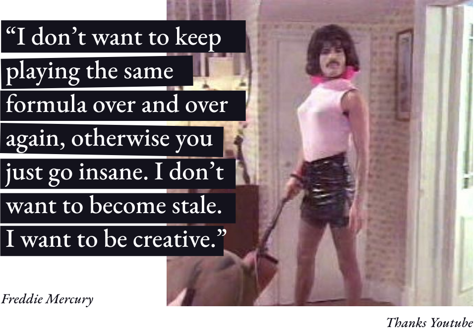
Don’t you find websites often look and feel the same?
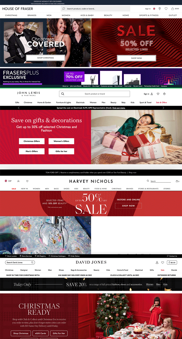
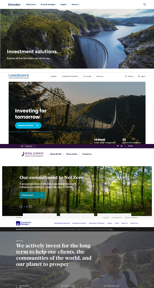
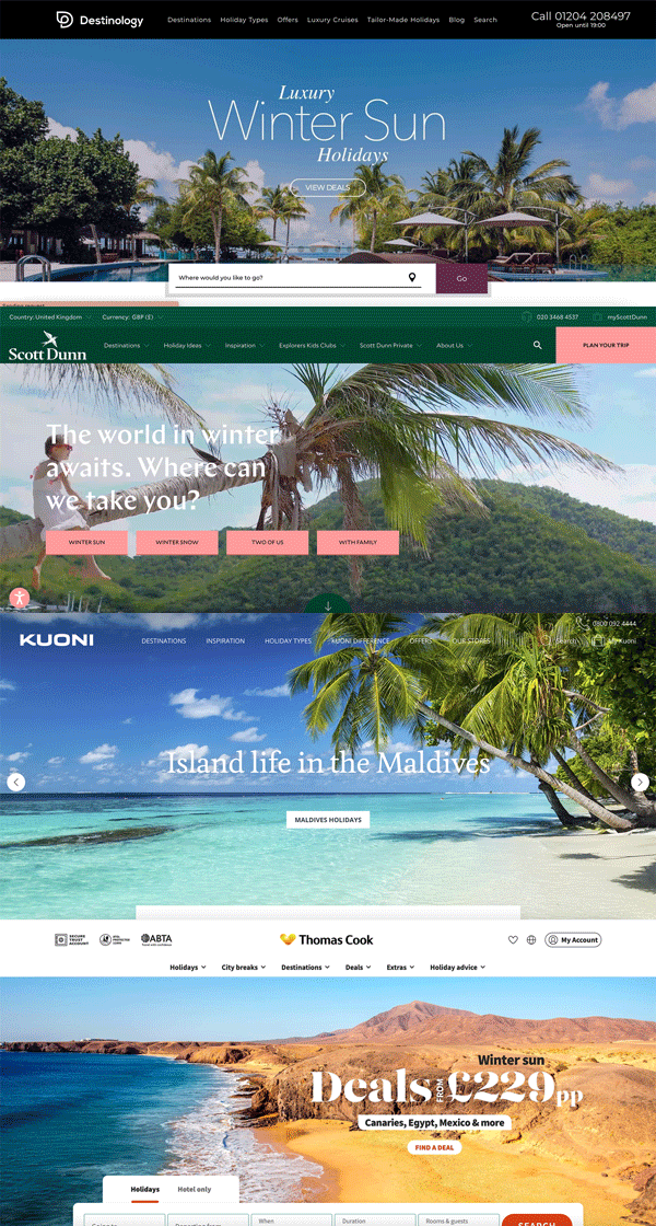
Have a go at replacing your logo on your website with one or two of your competitors’ logos. Notice anything? We thought so.
Do you click the click (and tap the tap)?
The vast majority of your prospective and existing customers will visit your website, probably many times. Do you know exactly what experience they are getting? Does the experience inspire your customer to want to develop a deep relationship with you?
If you want to do 100 things 1% better than your competitors, we would advocate every member of your leadership team “walks the walk” when it comes to analysing, investing in and driving improvements in your online brand and customer experience website.
If you’re letting the tail wag the dog and your tech team dictate your customer experience or your finance team determine your website priorities, you might be selling the value of your business short.
A website is not just for Christmas

Thanks The Scotsman
Your website is not a technology project and cost. It is the manifestation of your brand and a significant generator of value.
Your website is a constantly evolving beast that needs continuous attention, focus and improvement.
A great website can make your business a leader in your sector, transform your growth rate and create significant value in your brand (see our article about how to measure and grow the value of your brand by improving your brand experience):
Be clear on your purpose. Benchmark your website. Develop a distinctive creative strategy. Make your user experience a top priority for your leadership team.
Give us a call and our brand, user experience, data and technology teams will help you to do 100 things 1% better than your competitors.
Get in touch

The ChatGPT video version of this article:
The ChatGPT text version of this article:
And the GPT-4 transposed text response is here:
![]() Brief: Like an animal, how do you create and develop a best-in-class online user and brand experience through your website?
Brief: Like an animal, how do you create and develop a best-in-class online user and brand experience through your website?
![]() : Creating a best-in-class online user and brand experience through your website involves several key steps:
: Creating a best-in-class online user and brand experience through your website involves several key steps:
1. Define Your Brand Identity:
• Clearly define your brand’s values, mission, and personality.
• Ensure that your website’s design, content, and messaging align with your brand identity.
2. User-Centric Design:
• Prioritize user experience (UX) by making navigation intuitive and user-friendly.
• Optimize for mobile devices to accommodate a diverse user base.
3. Compelling Content:
• Create high-quality, engaging content that provides value to your audience.
• Use visuals, videos, and storytelling to convey your brand message effectively.
4. Speed and Performance:
• Optimize website loading speed to prevent user frustration.
• Regularly test and optimize for performance on different devices and browsers.
5. Accessibility:
• Ensure your website is accessible to people with disabilities, following WCAG guidelines.
• Implement alt text for images, readable fonts, and keyboard navigation.
6. Consistency:
• Maintain a consistent design, color scheme, and tone of voice throughout the website.
• Consistency helps reinforce your brand’s image.
7. Clear Call-to-Actions (CTAs):
• Use clear and compelling CTAs that guide users toward desired actions (e.g., sign up, buy, contact).
• Make sure CTAs are strategically placed within the content.
8. Analytics and Feedback:
• Implement web analytics tools to track user behavior and gather insights.
• Collect user feedback through surveys or contact forms to continuously improve.
9. Security and Trust:
• Secure user data and transactions with SSL certificates and strong encryption.
• Display trust indicators like security badges and privacy policies.
10. SEO Optimization:
• Optimize your website for search engines (SEO) to improve visibility in search results.
• Use relevant keywords and meta tags in your content.
11. Social Integration:
• Integrate social media sharing buttons and connect your social profiles.
• Foster engagement and community building through social platforms.
12. Performance Testing:
• Regularly test your website for compatibility with various browsers and devices.
• Conduct A/B testing to optimize layouts, content, and CTAs for better performance.
13. Continuous Improvement:
• Stay updated with industry trends and adapt your website accordingly.
• Regularly revisit and refine your website’s design and content to meet evolving user needs.
By combining these elements and maintaining a user-centric approach, you can create and develop a best-in-class online user and brand experience through your website.


