The logo – a crucial element of a business that defines your brand with a single, clear illustration.
The logic of a logo isn’t just one of aesthetic; it sends a message, tells a story as the business grows, and builds brand awareness as people get to know and recognise the brand over the years.
On May 11th, Instagram rolled out their new logo: a complete change from its rustic camera icon. This is the first real logo change the company, which launched in October 2010 with unimaginable success, has had.
Instagram posted a statement which explained the inspiration behind this dramatic change. It read, ‘Today we’re introducing a new look. You’ll see an updated icon and app design for Instagram. Inspired by the previous app icon, the new one represents a simpler camera and the rainbow lives on in gradient form’. the company explained that the app’s redesign would not change how it is navigated, rather, it’s been formulated to put yet more focus on photos.
Naturally, as with any big business change, the internet is the first to absolutely lose it. Some will laugh, some will cry and some simply cannot cope with this new change in their life.
All that taken into account, it seemed like the right time to compile a list of big brand logo changes and how the internet coped (or didn’t).
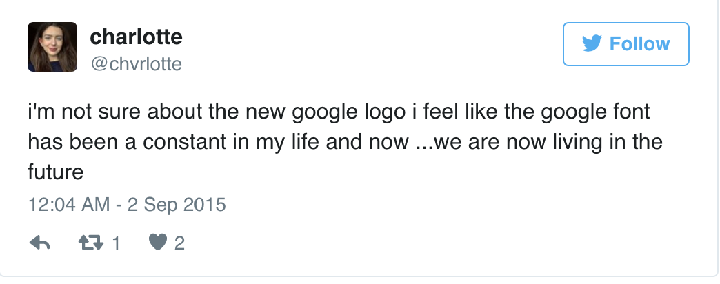
In September 2015, Google unveiled its first big logo change in 16 years. Although the only thing that really changed was its font style, from serif to sans serif, people leaped at the chance to express their thoughts.
Poor charlotte. Little did she know she’d be thrown into the future with such a simple change.
Tom doesn’t think Google is hip enough for this drastic change.

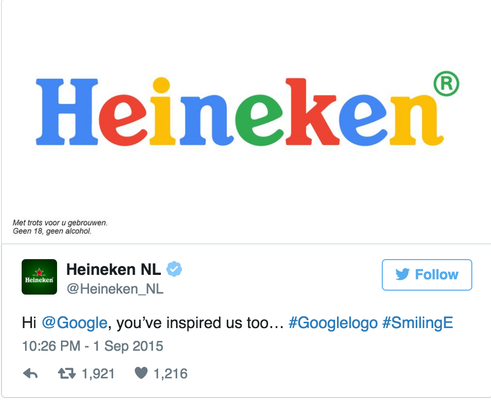
Even Heineken jumped on the band wagon.
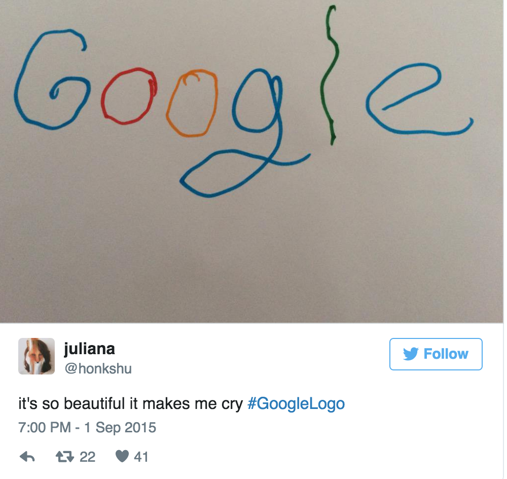
Juliana felt so inspired she recreated the new logo herself.
Uber
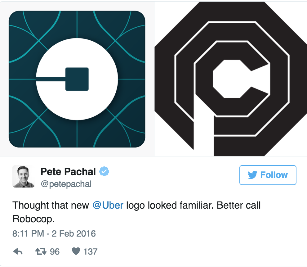
In February 2016, Uber released a new and unrecognisable logo. The company, which originated in San Fransico, explained that the new logo symbolises how its technology has grown and the places it serves.
The internet, on the other hand, wasn’t so enthused.
Pete does not approve of Uber stealing RoboCop’s vibe.
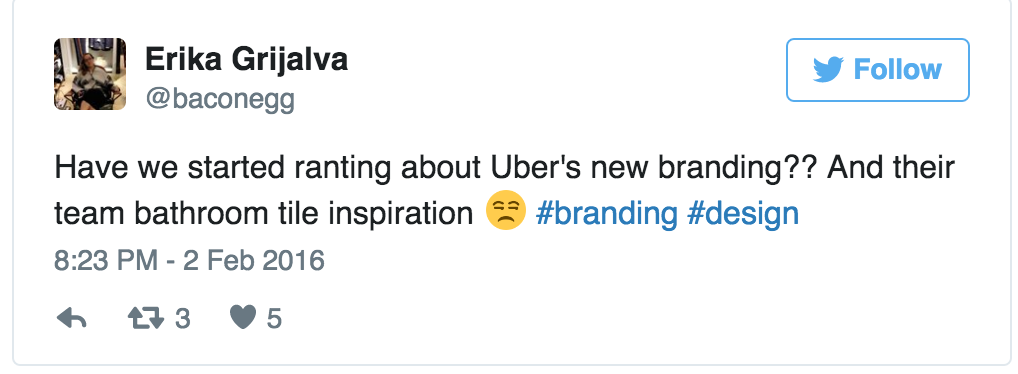
Erika feels this logo was most certainly created by tilers (Erika knows a lot about tiling).
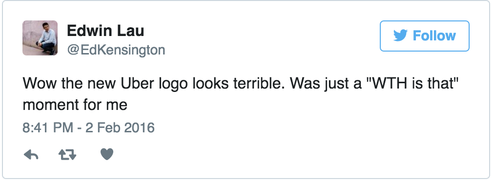
Edwin felt the logo gave him one of those moments. We feel you Edwin.
Jordan has a question, a serious one

In July 2015 Facebook updated their logo. It was very minor, but the company’s creative director Josh Higgins insisted it appears more friendly than the previous.
Here’s what the internet had to say:
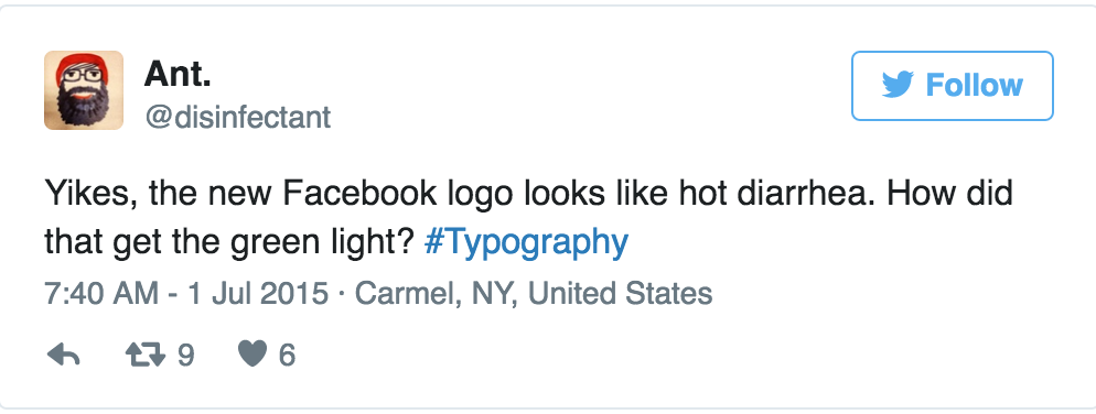
Ants opinion is it’s just plain poo really. There’s not much we can say to that.
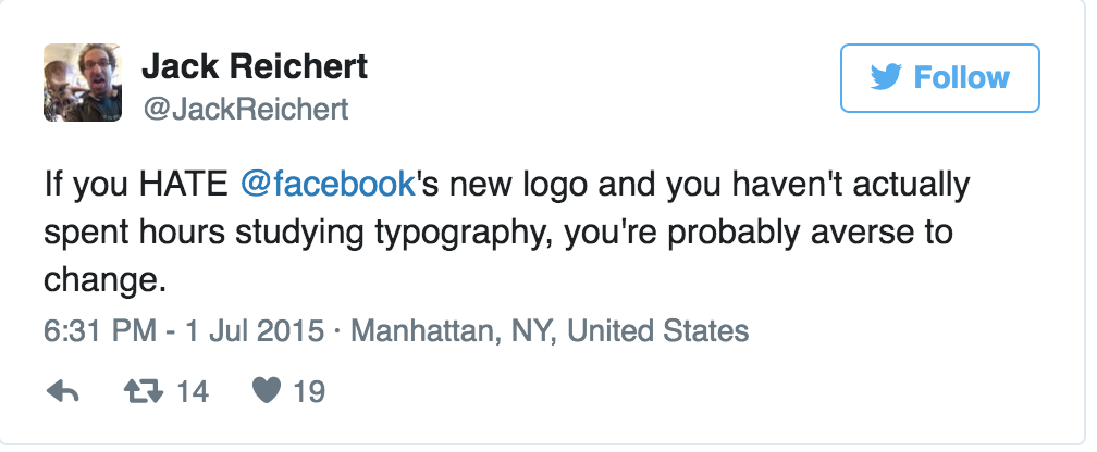
Jack claims that all the haters just cannot take change.
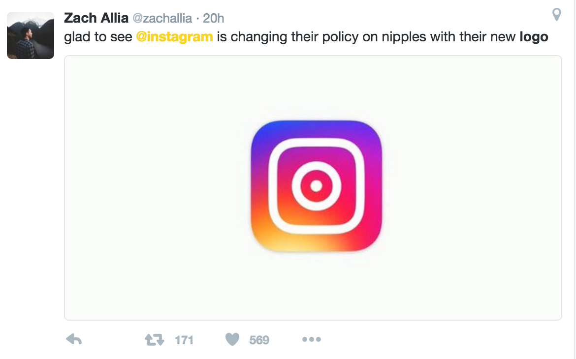
And finally to round up, let’s take a look at some reactions to Instagram’s new design:
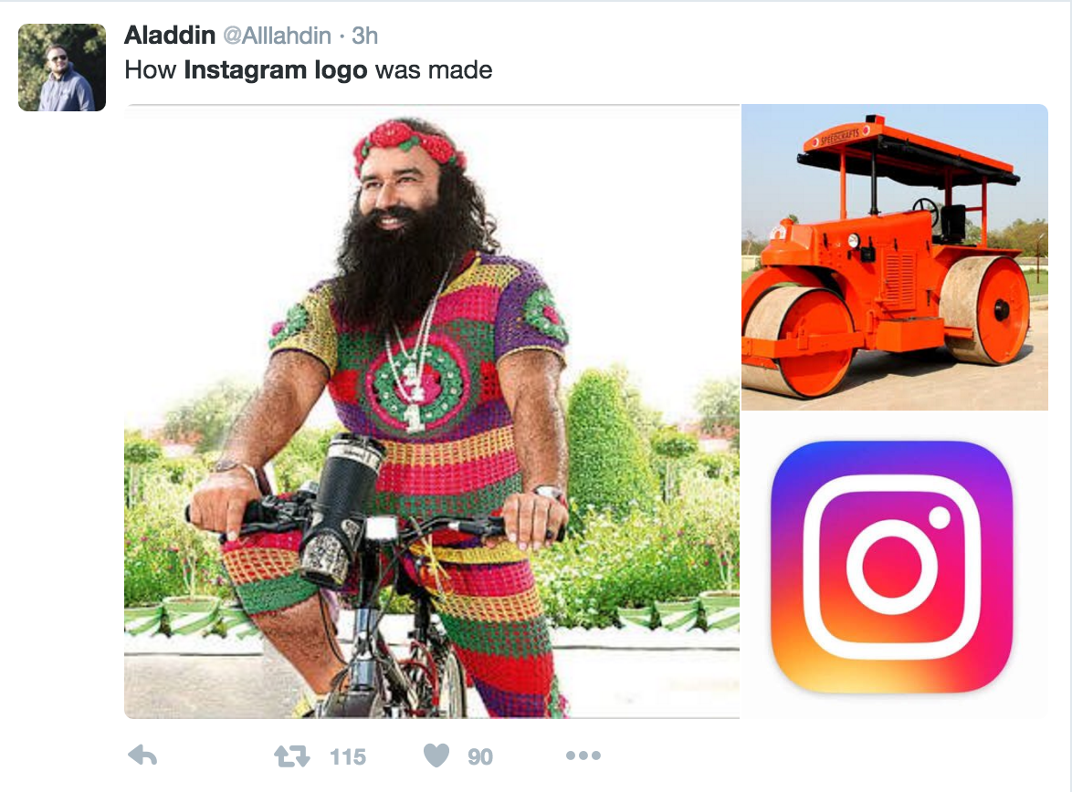
Prince Ali himself discovers the real inspiration behind the Instagram logo.
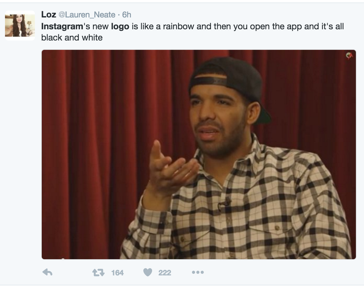
With the help of Drake, Loz expresses her sheer confusion on the app’s general design.
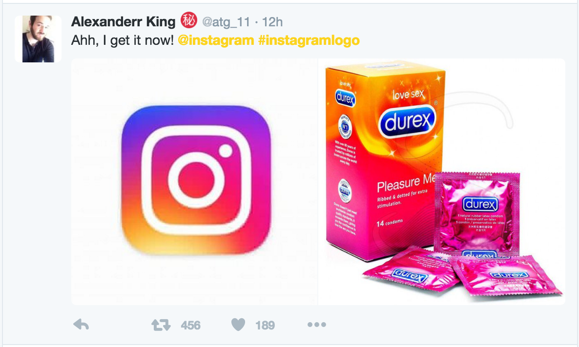
Alexander really gets it now, he really does.
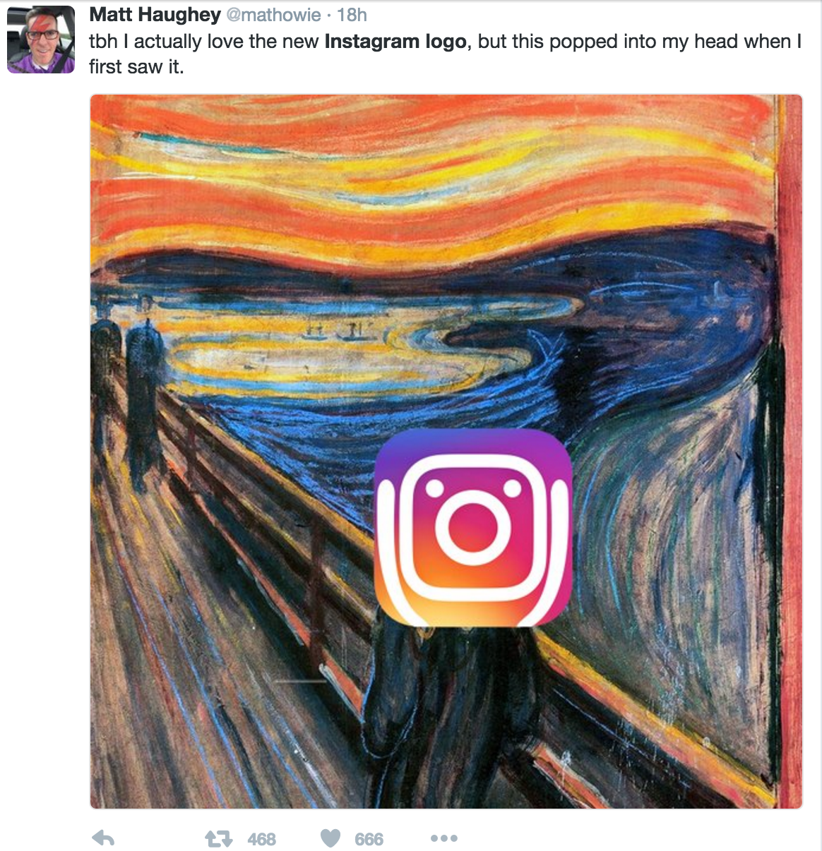
Matt just quite likes the Instagram logo to be honest.
Eve just doesn’t care about any of it.

#freethenipple
And Rob quite simply voices his opinion with the one and only emoji that could apply here.

What do you think of Instagram’s new logo? Tweet us @add_mustard


