Google’s guidelines state the importance of keeping site structure simple, in order for users to be able to “quickly and easy navigate your site to find the content they are looking for” and for “search engines to easily crawl your site”. This is logical, but the question of ‘how simple?’ is slightly more ambiguous. Here Tom Wilson, addmustard’s Senior SEO Analyst, gives his insight into approaching your site architecture and discusses the rise of the ‘targeted landing page’.
Use your judgement.
When architecting large sites, webmasters take great pride in knowing that every page is filed neatly away under relevant and optimised folders, ready to be crawled and indexed by search engine spiders. However, as with everything in life, moderation is key. Adding too many folders in your URL structure can give the impression of a site with vast depth and can cause nightmares for URL changes as well as content creation.
Is Google favouring exact match landing pages?
Here, we’re looking at two structural approaches to an e-commerce site:
Option A: (URLs with targeted keywords stemming directly from the route)
joesfarm.com/free-range-chicken-eggs/
VS
Option B: (pages with URLs that follow a semantic folder structure)
joesfarm.com/organic/free-range/chicken/eggs/
Although the folder structure used in option B is unlikely to result in a detrimental impact on organic rankings, the site may find that the shorter folder structure in option A could contribute to a ranking improvement. Targeting the big money keywords with a near non existent folder structure means that search engines and users are able to instantly see the targeted term. A hybrid of this structure is seen on Amazon’s sites where category folders stack up and make up directories but individual products stem directly from the root.

Case in point
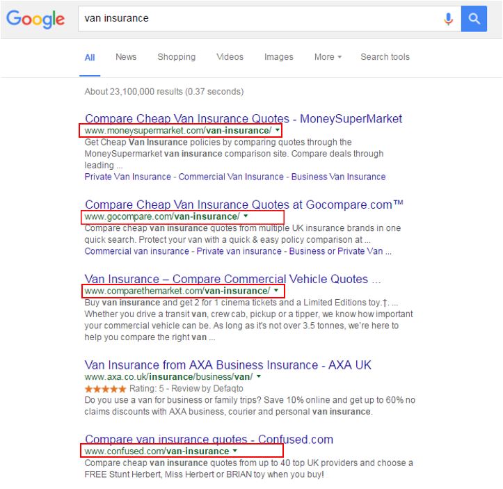
In a real-world example, using the search term ‘van insurance’, Google is seen to be favouring hubs dedicated to the exact match of that term. 7 of the top 10 results contain an exact match to the term in a folder off the root of the domain e.g. domain.com/van-insurance/ (including the entire top 3).
Human vs Engines
Human readability plays an important part here, with all results on the top two pages of Google having an easily readable URL. This means that both user and search engine know exactly what the page is about regardless of what other information accompanies it.
Looking further into this SERP and using the GoCompare site as an example, logic dictates that a company of this magnitude should deploy a folder structure that gives homes to its extensive breadth of services.
Not in the eyes of Google!
Instead of the site having logical folders (/money/, /insurance/, /travel/ etc) and landing pages which flow naturally, all big money landing pages stem directly from the root.
http://www.gocompare.com/motorbike-insurance/
http://www.gocompare.com/credit-cards/
http://www.gocompare.com/savings/
In fact, this method of site architecture is seen universally among the top insurance players. The mark of a highly volatile and competitive market? Other industries seen to take on a similar strategy: Money Exchange, Hotels, Credit Cards.
Is travel behind the curve?
A market that hasn’t fully embraced this strategy yet is the travel market. Of the top destinations spot checked (‘spain holidays’, ‘USA holidays’, ‘rome holidays’), only one result in Google’s top ten results was seen to be embracing this strategy. But as with everything in search, this may be set to quickly evolve.
Best practice
Use your judgement when architecting your site, are your URLs readable to a user? How many levels of folders do you really need? Will instances arise where duplicate folders exist (appearing as keyword stuffing)? These are questions that will be dependant on the industry in which your site sits. It’s important to assess the close competition but bear in mind that what works for them may not be applicable to your site.


