It’s that time again when the spotlight falls on our UX battlefield. This month, we’re taking a look at the philanthropic sphere by reviewing the websites of two well known charitable organisations; Amnesty International and Médecins Sans Frontières. Our Creative Team offers an expert opinion on how these associations deliver their campaigns, relay current issues and encourage fundraising and participation through their websites’ UX design. Read on to find out who will go home with our highly-anticipated Best in UX trophy.
Round 1: Navigation
Amnesty
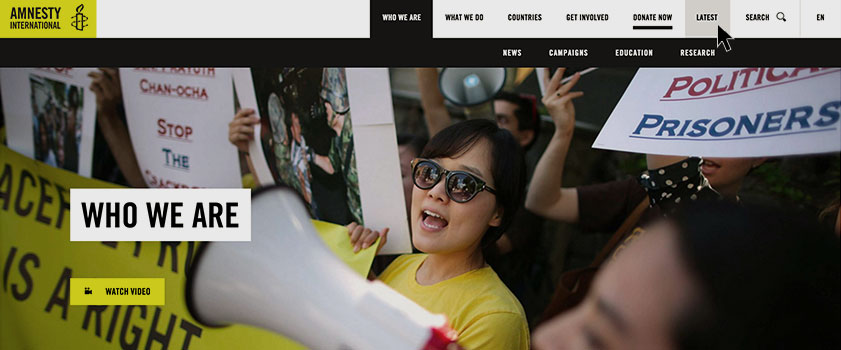
Amnesty delivers a well organised site using clear categorisation in it’s top panel, with each page following a similarly organised and consistent structure. Crucial call-to-action buttons (see below) that must be prominent to all visitors, such as ‘Donate’ and ‘Become a Follower’, have been given adequate space, ensuring they stand out, which should lead to an increased CTR.
MSF
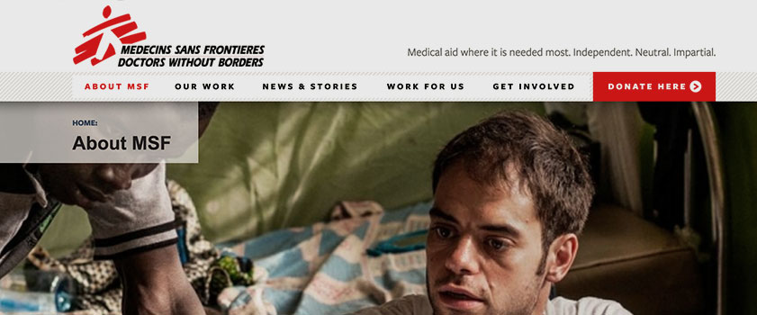
Comparatively, Médecins Sans Frontières’ homepage feels cluttered. The use of two top category panels may lead to confusion for the visitor, and social media is given little importance as a small pop out, seeming almost like an afterthought. However, the use of dropdown menus do help to break up sections of the site and call to action buttons are made engaging by using icons to convey meaning.
Amnesty: 1 point / MSF: 1 point
Round 2: Messaging and Imagery
Amnesty
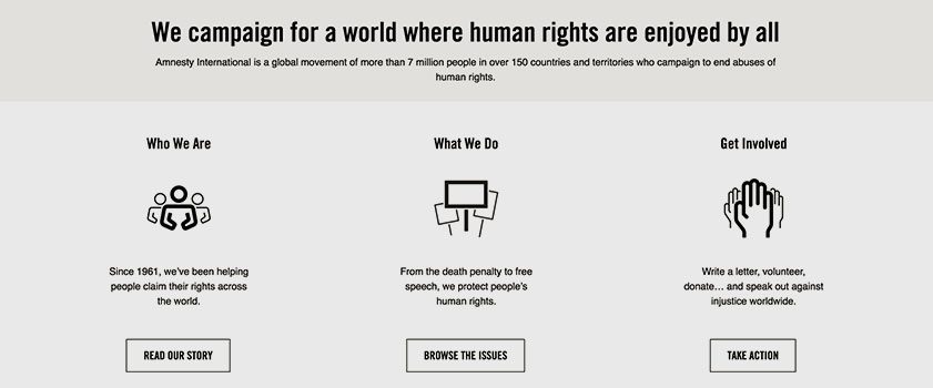
Amnesty is all about the bold and the brazen when it comes to messaging and imagery. Each page utilises a large, striking main image alongside minimal text, picking out key headlines in a large font. The homepage presents the slogan in large, bold type ensuring the company’s ethos is as prominent as possible. A small feature, but one worth noting, is the use of an underline on the ‘Donate Now’ button which helps make it stand out in the top panel, driving action here above anything else.
MSF

MSF also takes a bold approach in their imagery; using large, emotive photography and choosing a red base to the colour palette. The colour red has connotations of danger and in the UK, the emergency services, making it well suited to the association whilst engaging the viewer. The brand’s ethos is featured on the homepage, however, unfortunately without much prominence in a small, light grey typeface which fails to make as much impact as the words themselves.
Amnesty: 1 point
Round 3: CTA
A call to action is an instruction to the user to provoke an immediate response. Having calls to action throughout a site will enable users to be led clearly and directly to registration or donation pages. For these two websites, the main call to action has to be the Donate button.
Amnesty
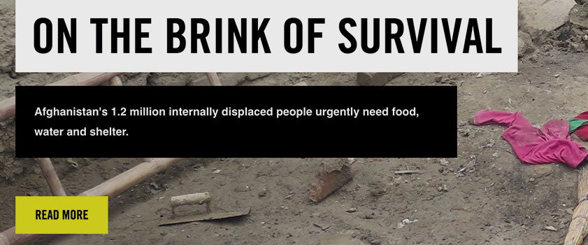
Surprisingly, Amnesty doesn’t use its brightest brand colour for the Donate CTA but instead to learn more about the causes they support. They take a minimalistic approach and avoid having too much colour. However, the journey through the site is still very clear to the user.
MSF
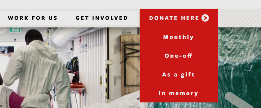
MSF uses the red of the logo as a lead CTA colour which makes it very visible throughout the visitor’s journey. The Donate button is featured in the header and footer which means its always made available to the user once they are ready to donate. They have also added a drop down to choose the type of donation, making donating as easy and clear as possible for the user.
CTAs on mobile and tablet vary with these charities. MSF is also ahead in terms of responsive design, with the fundamental Donate page remaining just one click away on mobile and tablet. Amnesty hides this option within the ‘burger’ menu on smaller devices, doubling the clicks required from the user in order to action.
Amnesty: 1 point / MSF: 1 point
Round 4: Functionality
Amnesty
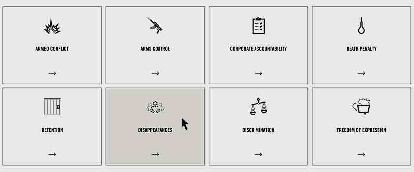
Amnesty’s website is very intuitive and offers reactions to the user’s mouse hover on all links. The ‘sticky navigation’ follows the user as they scroll down the page, which makes it easy to move further into the site. The use of icons in place of text also adds further clarity and interest and prevents text heavy pages.
MSF
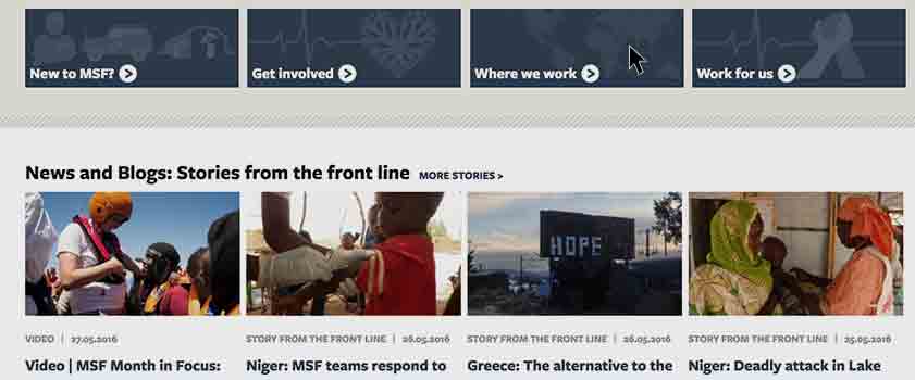
MSF has small elements of reaction functionality on its website, however, it’s not always very intuitive. Adding a hover state on some articles could help the user throughout the site. Shortening the drop down menu, which currently is very lengthy, could also minimise user confusion.
Amnesty: 1 points
The Results: Amnesty 4 – MSF 2
For two of the most prominent charity organisations worldwide, it is fundamental to have a website which encompasses and endorses their values and promotes involvement in their campaigns. We have to commend both Amnesty and MSF for their well thought out, authentic approach to their sites’ UX.
However, in our eyes, Amnesty has the edge with a clear user journey through the site thanks to an organised layout and effective use of typography and imagery. They have also embraced the function of intuitive reactions, adding interest to the site and hopefully increasing click through and engagement. Their design choices clearly echo their values, securing trust and assurance with their audience. Well done Amnesty!
On a final note, we hope that learning more about these associations and the care they take will encourage donations to both worthy causes. Both of which can be done via the links below should you so wish!
Donate to Amnesty International
Donate to Médecins Sans Frontières


