The world’s number one online fashion retailer, ASOS, and high street-turned-etailer Urban Outfitters both dominate the digital landscape when it comes to NewGen clothing. Selling hundreds of thousands of products via their online stores and delivering across the globe, an efficient and user-friendly web interface is not just important but fundamental to their success.
In a new series from addmustard, we pit these two heavyweight online retailers against each other by dissecting their online shop window – the homepage. The aim? To find out who takes this month’s illustrious “Best in UX” trophy.
Round 1: Navigation
ASOS
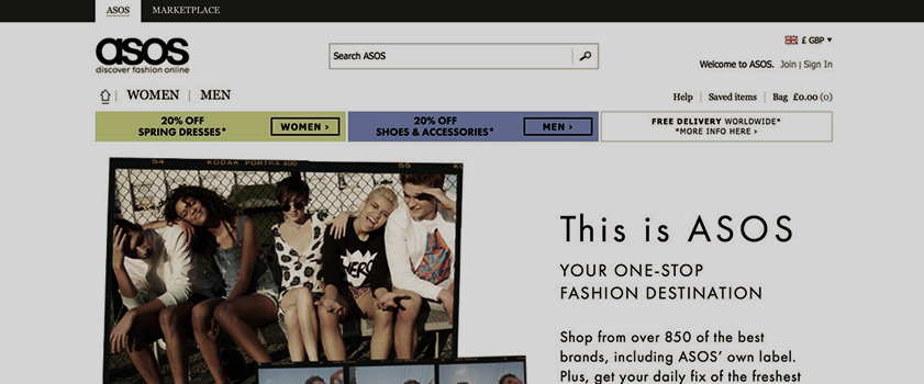
ASOS, like its shopping range, is not one to shy away from variation. Multiple colours, fonts and button styles feature in the site’s navigation, which lacks consistency for the user. ASOS cram a huge amount of content into their drop-down navigation bar, possibly overcomplicating the options and bombarding the user. Heat-map user analysis, such as that provided by HotJar, would help establish which navigation links are, and are not, being used.
Urban Outfitters
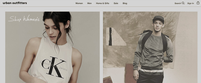
Aesthetically, this homepage is a dream for graphic designers! The brand has adopted a minimalistic approach, with few colours and plenty of white space. The negative space helps ensure the important elements stand out and allows users to easily navigate through to their chosen product range. Urban Outfitter’s navigation bar is broken down into six tabs which, when clicked, take the user through to a dedicated lower-level homepage, making it easier for the user to understand and digest information. It is worth noting that this approach does, however, add an extra click.
Urban Outfitters: 1 Point
Round 2: Messaging and imagery
ASOS
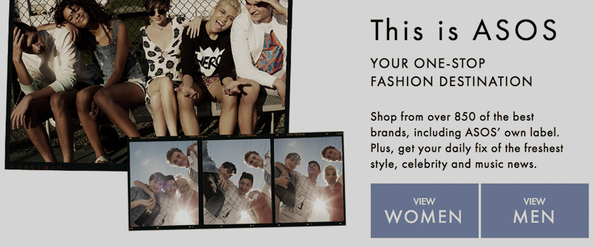
ASOS’s opening line on their homepage is “This is ASOS” … just in case you had forgotten after typing the brand name into Google or perhaps even missed the bold logo when you landed on the page. The imagery and layout is reminiscent of a student’s bedroom wall, with groups of 20-something trendsetters peppered over the page. But seeing as that is in fact the brand’s core target audience, then well done ASOS and hats off to you!
Male and female targeted products are clearly divided by colour – blue and yellow respectively. Buttons are bold and take up a lot of real estate which tells us this is the first and most important question when you land on their website – ‘which gender are you shopping for’. An extremely logical approach considering the brand’s vast audience and enormous product range.
Urban Outfitters
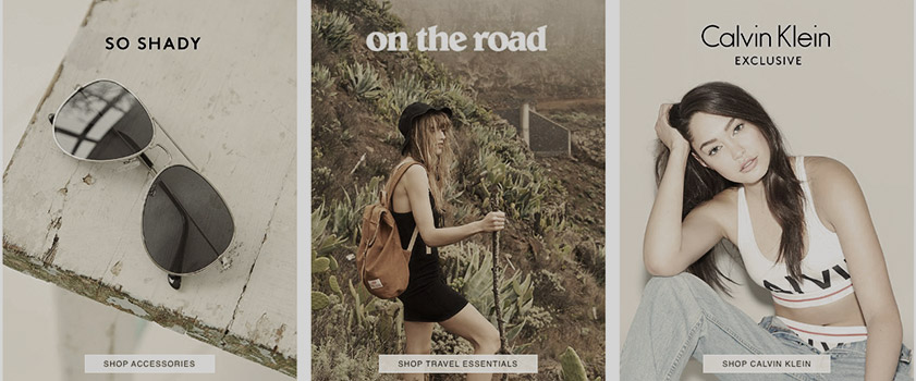
Heavy imagery supports the main navigation on Urban Outfitters’ website, with bold text, few colours and filters to saturate anything too bold. Perhaps there’s no use for colour coding when you can simply use an image of a male or female to differentiate the split. Promotional messaging uses an almost identical font to that which features on the rest of the page. Is this the best approach for a message that should jump off the page?
ASOS: 1 point
Round 3: Call to Action
ASOS

A call to action is an instruction to the user to provoke an immediate response, and a key difference between these two homepages is their approach to this. ASOS is very direct, using oversized blocks with generic ‘view’ handles to take you deeper into the site. It’s a method commonly used and seen as the most effective approach to achieve the desired click-through. There’s no reason to deviate if it’s working for ASOS.
Urban Outfitters
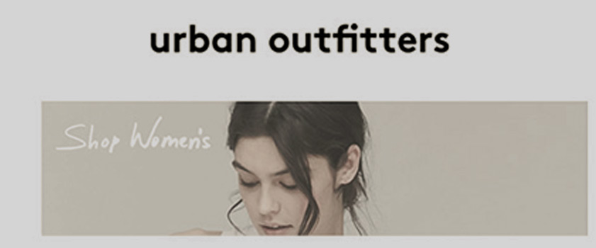
Urban Outfitters again take a minimalistic approach here, relying on reaction functionality to entice click–through. Images ‘react’ to a user hovering over them with the mouse by an increase in opacity. Urban Outfitters has chosen not to include boxed text CTAs with generic messaging like ‘click me’ or ‘buy me’. Perhaps a bold move, but it is something that we are seeing more and more sites do.
Users are becoming more intuitive about elements on web pages, and there is expectation that a door will open when clicked. Digital marketing is always evolving and this is one small but significant change in how users are being trained to think.
ASOS: 1 point / Urban Outfitters: 1 point
Round 4: Functionality
ASOS
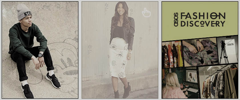
ASOS has started to add small elements of reaction functionality on their website and although this movement does jump out at the user, it’s simply not intuitive enough. With the amount of technical and development resource we presume ASOS has available, it feels like a tired page. Basic elements could be introduced to improve this, such as a ‘sticky’ navigation bar, losing the ancient drop shadow effect, and rethinking the segmentation to help break up the page.
Urban Outfitters
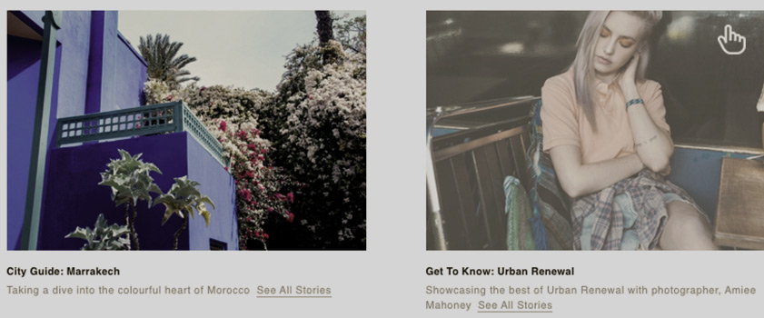
However, Urban Outfitters has used a number of basic functions on the homepage to improve user experience, offering reactions to a user’s mouse hover on all links and a ‘sticky’ navigation bar which follows the user down the page when they scroll. Although there’s a lack of buttons and colours to help direct users to a click, less is more seems to have gone a long way for this brand.
Urban Outfitters: 1 point
The Result: ASOS 2 – Urban Outfitters 3
Urban Outfitters takes the trophy!
We hear that ASOS has major updates planned for 2016, so maybe we aren’t the first to point out the need to step up the site design to counter its prettier rival.
Our congratulations go to Urban Outfitters. Your clean, almost laid-back approach clearly delivers your tone of voice, is hip, on trend, and targets your core audience of 16-25 year olds in a language and style that they understand. addmustard’s first UX trophy is yours!


