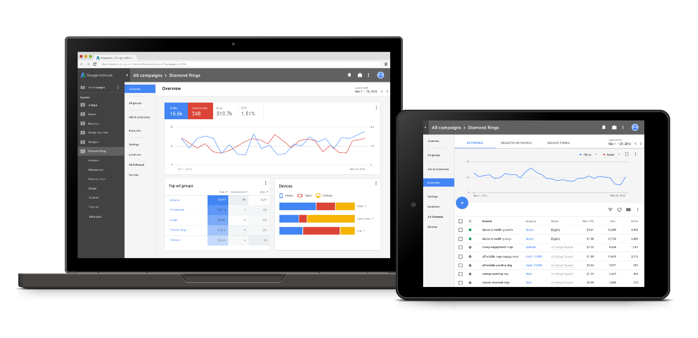
News broke out at the end of March that Google were completely redesigning their AdWords interface to essentially keep up with the ever changing times. AdWords as a platform is now over 15 years old and hasn’t seen as significant an overhaul since 2008. With many bloggers/users making their dream UI requests, Google have been teasing everyone with the occasional screenshot samples.
What can we expect from the new interface?
- A cleaner more user friendly design based on Google’s design language, Material Design, used in other products such as Gmail, Maps and Search.
- A much easier-to-read dashboard view replacing the home screen and renamed the “Overview” screen.
- Settings such as Locations, Sitelinks and Devices will be more easily accessible in the left side panel similar to the new AdWords editor rolled out last year.
Existing advertisers should not experience any downtime or changes to the structure of their campaigns or ad groups.
Just last week, Google announced at their annual performance summit, that they will be showcasing a live demo of the redesign on May 24th in San Francisco and user’s will be able to watch via livestream.
End of March, Google released this teaser image of the proposed interface appearance:

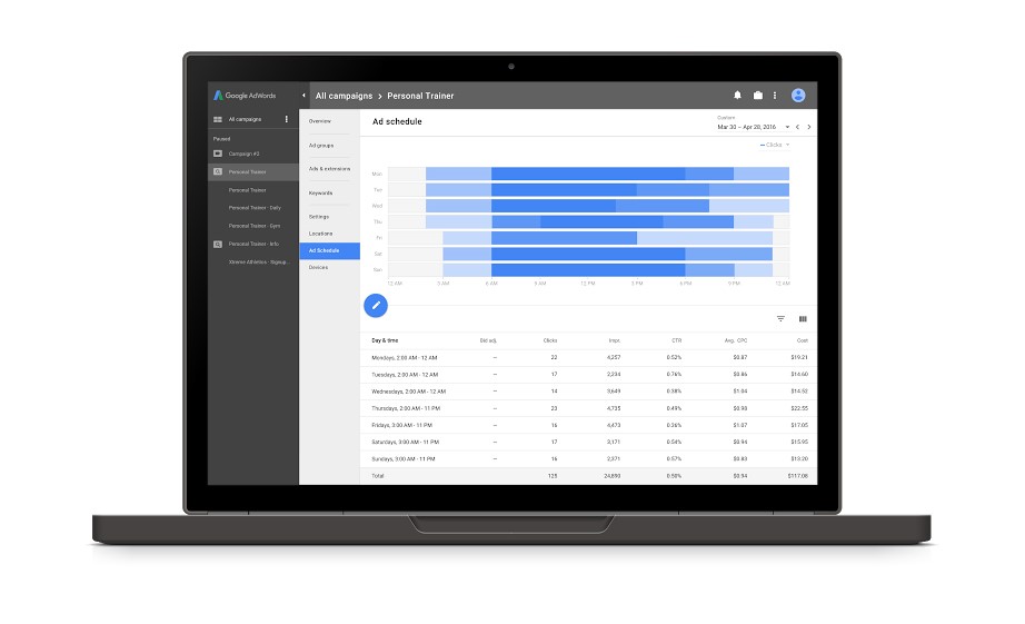
Google released this image last week of how ad scheduling will look in the new UI.

Kerry Williams, SEM Senior Analyst at addmustard had this to say on the matter: “I for one am very excited and intrigued about this. Having only been involved in PPC for 2 years, the interface for me did look slightly dated, sluggish and error-prone, especially when you look at how Bing has overhauled its look since the takeover from Microsoft. I welcome this change and look forward to working with it. I’m hoping this will improve productivity and make it easier for everyone, new or experienced”.
Users can register for the livestream here.


