I’ll admit map reading was not at the top of my agenda for a day’s training with branding leader Michael Johnson; but contrary to my original assumptions, it turns out maps aren’t solely used by the hiking community! Ok, I’m paraphrasing a bit here, but similarly to orienteering; branding can be a zigzagging process, and a long-winded one at that. So the route map Michael trained me up with is just what I needed.
Michael approached the workshop by exploring quotes that define what branding truly is. These included statements from some of the big names in branding:
‘Your brand is what other people say about you when you’re not in the room.’
– Jeff Bezos
‘Overall, because branding is about creating and sustaining trust it means delivering on promises. The best and most successful brands are completely coherent. Every aspect of what they do and what they are reinforces everything else.’
– Wally Olins
These statements suggest that essentially branding is made up of two things; ownership and status. Michael used the example of aeroplanes to demonstrate this summary. Each commercial plane is a completely faceless, blank canvas in its début. It’s not until different corporations paste their marking over the top that they take on a new entity. They have a personality, they stand for one company’s values and no one else’s.
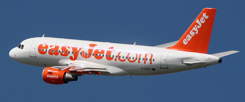
That being said, it drives the point that despite a product being basically the same; branding can have a powerful impact on people’s decision making. In a competitive landscape, brands need to stand out; proving that they either provide the best or most interesting product.
But achieving this is another matter entirely. This is when Michael’s advice came into play…
Investigation
Often the dreaded part of the process when the enormity of the task can seem overwhelming, the investigation stage can be difficult and confusing.
That is until Michael introduced us to his maverick mapping devices, which I am without a doubt making use of in future projects! Created to get a sense of the marketplace, finding out where the brand currently stands, and where it aspires to be, the maps are ideal for getting a bird-eye-view of a brand’s positioning.
We tested it out for ourselves, taking a brand of our choice that we think could benefit from a rebrand, and identifying where it currently stands in the market. Two maps were used, the first to gain a generic view of the landscape and fundamentals of the brand and a second to delve deeper, ‘unlocking the market’ and identifying any possible gaps.
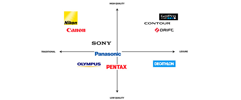
Continuing with the aviation theme, Michael presented a case study of where his mapping technique had been used on a rebrand for a previous client: Virgin Atlantic. They identified from it that most high-end airlines opted for a serious tone of voice, whilst ‘fun’ and ‘laid-back’ were characteristics only ever exhibited by budget enterprises in the area.
On observing this gaping hole on the map, Johnson Banks questioned, ‘why can’t expensive also mean fun?’, and seized an exciting opportunity for a new hybrid to enter the market. Virgin Atlantic redefined themselves as a stylish premium airline putting enjoyment at the centre of their existence, promoting the idea that when you step onto a plane your holiday has already begun. A clear verbal narrative was secured of: ‘Everyday Pioneers’.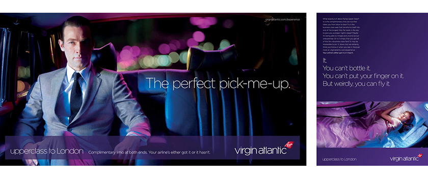
6 Brand Questions
Once the brand landscape and vision for the rebrand had been worked out, we were then presented with a host of questions on how to effectively action the rebrand.
Graphic Design authorities have drawn up countless diagrams over the years. This has raised a problem though; with so many diagrams to choose from (often filled with branding jargon), it all gets very confusing. Example: does anyone really know what ‘Brand Equity’ even means?
Michael found a way of condensing the fundamentals into one simple set of questions you can apply to most brands…without the jargon. These questions simplify all of the factors influencing the inherent and displayed traits of a brand, like who their audience is and what sets them apart from their competitors, shown in the diagram below:
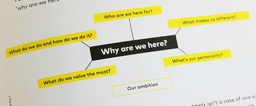
To demonstrate just how effective posing these questions is, we looked at a range of examples in which answering a specific question had helped to underpin the essence of the brand:
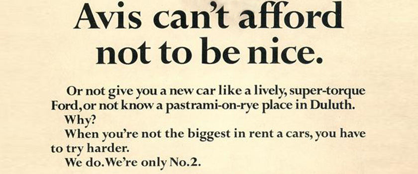
Avis pioneered the ironic tone of voice in their early advertising: ‘When you’re not the biggest in rent a-cars you have to try harder, we do we’re only number 2’. In having the courage to be different they secured a successful and enduring campaign.

Dove have earned a lot of respect for their ground-breaking approach to challenging society’s perceptions of beauty. Centring their brand on their personality; down to earth, wholesome and confident; something that resonates much more with your ‘everyday woman’.
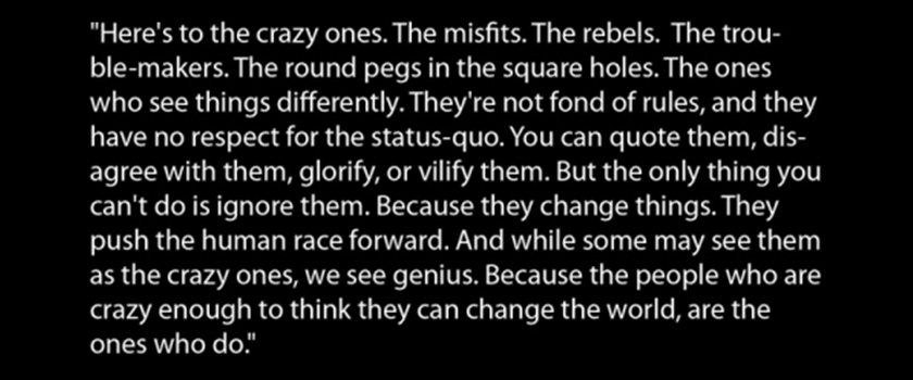
Apple’s famous manifesto is an unashamedly outspoken demonstration of their values. Bold enough to say ‘this is who we are, this is what we stand for, take it or leave it’ and in doing so attaining a voice.
That Crucial Half Step
The final concept Michael spoke about was the ‘half step’. This is all about bridging the gap between the branding ideas on paper and making them workable in design. Taking a holistic view of the implementation, it’s equally important to take both design and communication of a brand into account. So in design terms: how will it be structured? Will it be in monolithic form (a main brand used across multiple products, i.e Fedex), or endorsed (individual and distinct product brands, which are linked together by a parent brand, i.e Cadbury). Then in functionality terms: how do we make it as accessible as possible? Is it universally pronounceable for example, does it translate well into other languages
Foregoing these considerations could lead to awkward consequences:
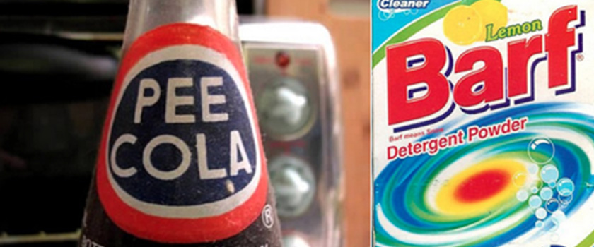
Names can make or break a brand. If they are applicable and popular enough they could even achieve the holy grail of adjective status (i.e Googled).
Michael got us to do a quick-fire naming exercise at this point. The panic was palpable as he instructed us to come up with around 30 different potential names for our new brand in the following 5 minutes. These could be formed of word merges, associations, and shapes. Unsurprisingly a high proportion of the results were certified crap. However, I did get the rationale behind the fast thinking/ reeling off ideas when a few gems presented themselves. In the initial naming it’s easy to agonise and overthink. This exercise, though uncomfortable was effective as it forced all my thoughts onto a page, and produced some surprising results.
The actual design bit
Another surprise of the training was that the percentage of time spent on actual design was very minimal, considering it was training aimed towards graphic design professionals. My degree and workplace experience has given me the sense to know that good research equals better results, but the level of exploration implemented in the workshop would’ve made me twitchy if it had been a project under my own steam.
Usually I would have felt guilty that I was ‘wasting time’, but the workshop really emphasised the importance of context before anything else. Without this, we can’t claim to be branding authorities. Not only does valid research give substance to the creative outcomes, it also speeds up the process and makes it more focussed in the long run.
So I suppose I could say that my training has made me design less, and read maps more. I still wouldn’t volunteer myself to go on an orienteering trip any time soon though!


