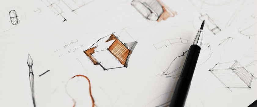
“Product design works in tandem with user experience”
There are many similarities between the creative approach to designing a physical product and how we go about building a website that are often overlooked by digital designers. Put simply, they all boil down to answering two things:
- the need of the user
- the want(s) of a user
For this month’s design insight, we decided to delve deeper into the connection between physical product creation and web design. So the creative masterminds at addmustard recently undertook a workshop to illustrate the parallels between the two. Intrigued? Then read on…
WHAT WE LOOKED AT
Consideration was firstly given to what a user needs a physical product to do and, to apply this to the digital landscape, by looking at the user experience (UX) delivered by a website.
User Needs = User Experience (UX)
Let’s take the example of a rain jacket. A consumer’s first thought when deciding to purchase this product will be to benefit from its practical attributes, which in this case is to keep them dry in wet weather. As long as the jacket succeeds in doing this, a solid user experience has been delivered.
Moving this online, a website also needs to deliver the attributes it promises to its users. For example, a company who sells flights online needs a website that can allow users to input their requirements, browse flights, select different options, and ultimately make a booking. If a website doesn’t allow users to do this, or they have to put up with a painfully-slow loading time at each step of their booking, then the user experience is not satisfactory as the user’s basic need is not being fulfilled.
User Wants = Aesthetics or User Interface (UI)
Back to the the rain jacket. A consumer who knows they want to buy this product will most likely visit a shop to look at the range available, deliberating over a certain colour, the number and placement of pockets, the fit, the brand, and a combination of many other aesthetic factors. In short, they care about the look of their rain coat, as well as its practical functions, and these attributes are very important in the decision to buy.
Visual appearance is equally of great importance in the digital world, too. A good illustration of this can again be provided by our flight website. Imagine the user finds that they can book their flight online, but to do so they must wade through a confusing site layout and endure a lack of images and barely legible text. In this example, the website’s unpleasant User Interface overshadows its practical ability to provide the customer with a satisfactory booking experience.
“It’s false to believe that if your UI is strong, then the UX will be, too”
…and vice versa
The examples above show that this statement is as true for website creation as it is for physical products. Having a solid UX is one element, but if the user does not enjoy using it, or it is not visually appealing, the website is much more likely to fail. In the same way, having an attractive digital platform or product that doesn’t deliver on the practical promise will always fall short by deterring visitors or failing to convert.
What is clear, is that regardless of whether the product is digital or physical, designers need to remember that both UX and UI must be at the forefront of our minds throughout the creative process. The aim must be to produce a product that looks strong visually, but also delivers a solid, consistent experience for the user, therefore meeting both sets of expectations.


