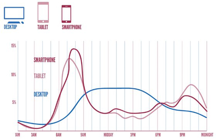
Today, 91% of us use mobile for inspiration when we’re in the middle of a task. 82% of us will consult our phone in a shop, and 51% have purchased from a different brand to the one they intended, because the information provided was useful. These are just three examples from a multitude of stats that put the importance of writing for mobile into perspective.
Think about your own mobile usage throughout the day. We turn to our mobiles for answers, inspiration and entertainment around the clock. Mobile usage peaks far above desktop usage every day, and the competition’s steep. In short, a responsive web design simply isn’t a stand-alone strategy.

On mobile, users expect to do the same pre-purchase research as they would on a desktop, but a lot faster. Here are our 6 quick tips on writing for mobile.
1. Grab their attention
When writing for mobile you need to put your journo’s hat on. A hard-hitting headline will grab your reader’s attention. Starting your piece with a series of short and sweet sentences will allow them to quickly decide whether they want to read on and find out more.
E-Write propose a ‘Bite, Snack, Meal’ approach to online writing. Treat your headline as the bite – instant gratification of what your piece contains. The snack could be a brief summary in two or three opening sentences. The meal is the in-depth body of your content. A pretty tasty concept, no?
2. Don’t hide the best bits
Generally, mobile users don’t have the time or the thumb strength (who are we kidding, the next generation will have super-thumbs) to scroll right to the bottom of the page. Similarly, they won’t read through every paragraph to seek out the good bits, so don’t hide them!
There’s no point being stubborn – trying to bend mobile users to your will will cause them to bounce. They have no allegiance to your content, so why not make everyone’s lives a little easier and give your readers what they’re looking for straightaway?

3. Is it legible?
It’s simple, but fundamental. Your content must answer a user’s need quickly – while they’re on the bus, in a queue, or waiting for a friend.
Lengthy words and excessive semicolons will often have mobile readers running for the hills, so present your point in short sentences of punchy words. Ultimately, try to answer their query like you would a face-to-face question.
4. Break it up
We’ve talked about sorting your content into digestible paragraphs before, and we mention it again. Headers, sub-headers and bullet points are crucial for guiding your reader through your text. They allow your reader to scan and find an answer to their query as quickly as possible, leaving them satisfied and far more likely to return to your site in the future.
5.Click to preview
Before you publish – always preview. Your piece might look great on desktop, but if there are misaligned paragraphs, oversized images and bunched sub-headers on a mobile device, your reader will be left dissatisfied. These are all issues that can be eradicated pre-publish.
6.Track, Learn, Grow.
It’s crucial to implement tracking for all content. Use Google Analytics to gain insight into which devices your audience is viewing your content on. With real-world statistics to base changes on, you can optimise your site knowing exactly how your viewers are interacting with your content.
GA is also brilliant at showing you how your users behave on your site – is there a particular page with an irregularly high bounce rate? It could be that there’s something amiss, from site speed to over-weighty content that needs your attention.
Smaller screen: Bigger picture
Today, more than ever, it is imperative content writers, SEOs, UX-ers and designers work together. Our readers are busy, constantly hounded, and clever. They’re also hungry. And so we must provide great content that answers a need in a clear, informative and attractive way across all devices.
Finally, just because your user is on a smaller screen, doesn’t mean they’re necessarily looking for lighter topics. Tackling the deeper issue on mobile is great, and there’s a big place for long-form content. Just make sure to dive in sharpish!


