In April we brought you the first instalment of our guide on creating Facebook Canvas Ads. This month we bring you part two, in which we will take you through the process of building an ad – in this example, one we created for a client within the travel sector.
Our goal was to create an immersive holiday ad experience for the user, thereby making it feel like they were already on holiday. Using all the different elements available to us within the interface and with the help of our talented design team, we collated the necessary photos and videos required and got started….
1. Create a new canvas in Facebook’s Power Editor, by clicking the ‘+’ button.
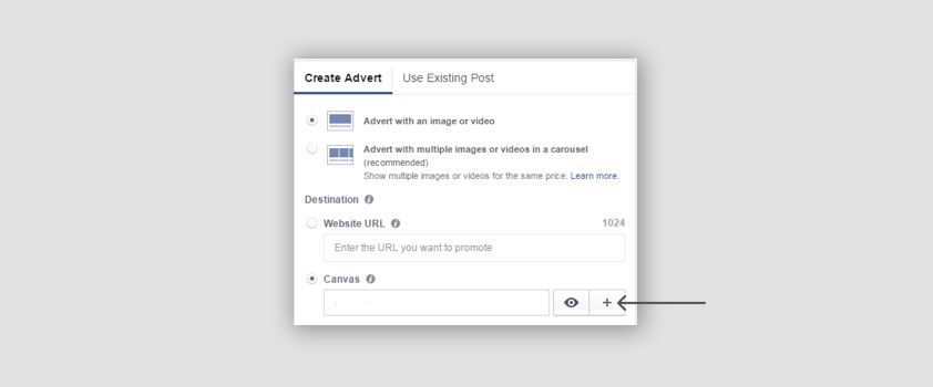
This opens up the ‘Canvas Builder’, which you’ll need to keep open during the whole creation process as changes aren’t possible once the canvas has been saved.
Be sure to name your canvas at the top – something unique and easy to identify.
Next comes the theme and header selection.
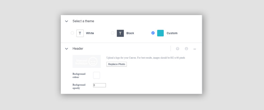
We went with a custom theme colour, which matched the brand. For the header we used an image of the brand logo in white with a transparent background. We also adjusted the background opacity to 0 so that no coloured bar appeared. It would then appear like so at the top of the screen throughout:
Note: A header isn’t compulsory, however it will keep the brand visible throughout the user’s experience within the ad, so keep that in mind!
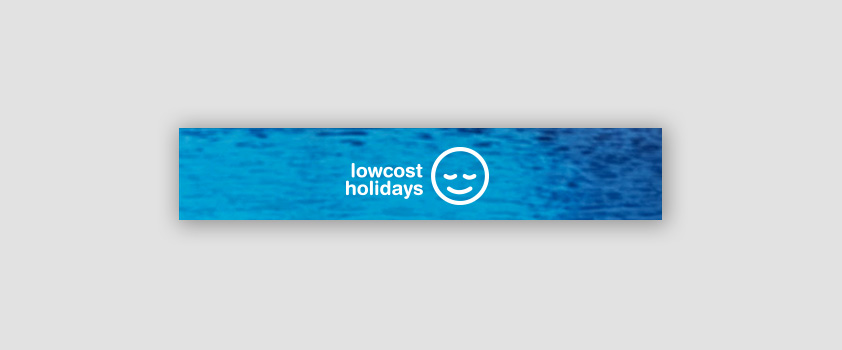
2. Our images had already been planned out by myself and created by our design team, so we uploaded this as a photo:
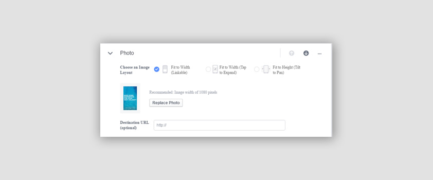
Note: Canvas ads will already come with scroll down/along arrows, but we added a note to the first image so that the user is aware of what is required from them. All images were set at 1080 x 1920 pixels to ensure high-quality resolution when on screen.
3. Next, a text panel was created and added:
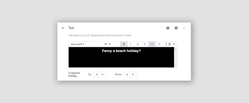
With the aim to both break up the images and communicate a little about what the client offer.
Note: the background colour of the text panel is in keeping with the theme set at the start of creation.
4. We added a video, and enabled the ability to tilt it.
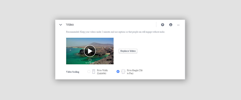
In our opinion, the video benefitted from having a “tilt to view more” graphic on the bottom so that the user knew what was possible.
5. A carousel of images that were relevant to the video was then added. Each image linked to their respective landing pages upon touch:
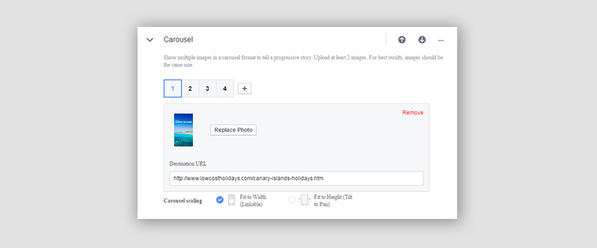
It was important that the images caught the eye of the user, and our design team did a great job of finding bright, sharp scenic images. Adding relevant text to each one helps sell the destination to the user.
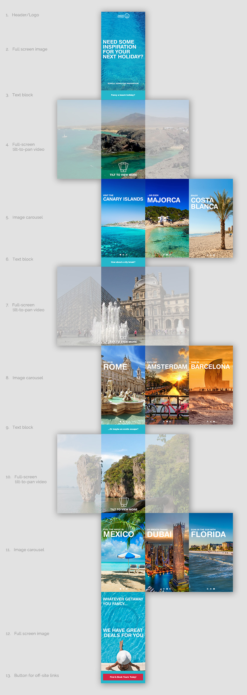
We then repeated steps 3-5 for city breaks and long haul holidays (see map).
6. The final step in creating the canvas was adding a closing photo and the all-important CTA button:

We arranged the text on this image so that when the final CTA button appeared, the text on the image would still show on the user’s screen. This meant that the user was left with the bottom half of the photo (including the text) and the final CTA button.
The button was added like so:
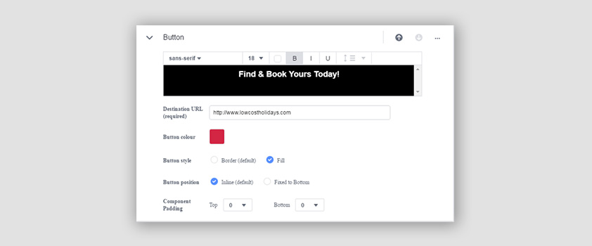
After this, our canvas ad creation was complete!
It’s important to note that if you are using any form of 3rd party tracking, you add it to any URLs you are using within the canvas ad BEFORE you save it, as you will not be able to edit it once it is saved.
Additionally, the canvas builder gives you the option to preview your canvas ad as a draft on a mobile device via Facebook before you save anything. It is crucial to test the canvas experience like a user would see it before you hit save.
Note: a personal account must be linked to the business account in order to do this.
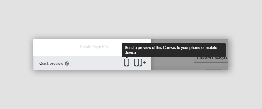
Once happy with your ad format, save and add as a new canvas template.
When setting up the ad to run, you’ll need to add a headline, text and image as per normal with any Facebook ad.
Here’s what ours looked like:
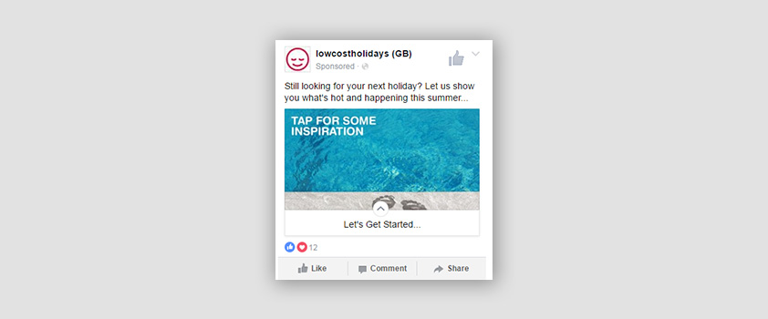
Here’s an image guide:
Any comments? Tweet us at @add_mustard


